UI Components
EmojiKit has UI components that you can use in your SwiftUI apps, such as grids and pickers.
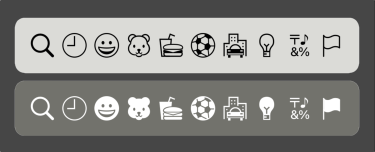
Images
EmojiKit has Image extensions for Emoji category icons:
You can either get the icon from a category:
Emoji.Category.smileys.icon
or by using the image extension:
Image.emojiCategory(.smileys)
Image.emojiCategorySearch
The image assets are vectorized.
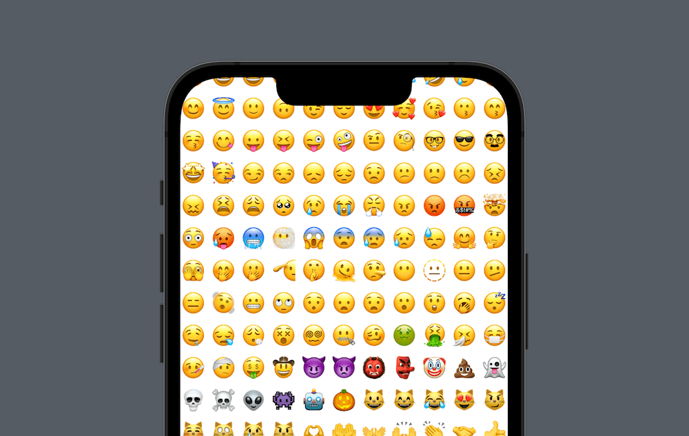
Emoji Grid
EmojiKit has an Emoji.Grid that lets you list emojis in a horizontal or vertical grid.
The following code renders a standard vertical grid with a standard configuration and item views:
struct ContentView: View {

    var body: some View {
        ScrollView(.vertical) {
            try? Emoji.Grid {
                $0.view
            }
        }
    }
}
This is the equivalent of typing out all the default parameter values:
struct ContentView: View {

    var body: some View {
        ScrollView(.vertical) {
            try? Emoji.Grid(
                emojis: .all,
                axes: .vertical,
                config: .standard,
                emojiView: { $0.view }
            )
        }
    }
}
You can provide a custom configuration, and customize the view for all or some emojis:
struct ContentView: View {

    var body: some View {
        ScrollView(axis) {
            try? Emoji.Grid(
                emojis: .all,
                axes: axis,
                config: .init(
                    font: .largeTitle,
                    itemSize: 35,
                    itemSpacing: 10
                ),
                emojiView: { params in
                    let isCrazy = params.emoji.char == "🤪"
                    params.view
                        .rotationEffect(.degrees(isCrazy ? 180 : 0))
                        .scaleEffect(isCrazy ? 1.5 : 1)
                }
            )
        }
    }
}
The grid is a very customizable component, and can also be used when iterating over categories.
Picker
EmojiKit has an Emoji.Picker that lets you pick emojis from a horizontally or vertically scrolling grid.
The following code renders a standard, vertical picker with a standard configuration and standard grid item views:
struct ContentView: View {

    @State
    private var selection: Emoji?

    var body: some View {
        try? Emoji.Picker(
            selection: $selection
        ) {
            $0.view
        }
    }
}
This is the equivalent of typing out all the default parameter values:
struct ContentView: View {

    @State
    private var selection: Emoji?

    var body: some View {
        ScrollView(.vertical) {
            try? Emoji.Grid(
                selection: $selection,
                emojis: .all,
                axes: .vertical,
                config: .standard,
                action: { _ in },
                emojiView: { $0.view }
            )
        }
    }
}
Since the picker doesn’t highlight the selected emoji, you can adjust the view builder to do so:
try? Emoji.Picker(
    selection: $selection,
    emojis: .all,
    axes: .vertical,
    action: { print($0) },
    emojiView: { params in
        let isSelected = params.isSelected
        params.view
            .scaleEffect(isSelected ? 1 : 0.9)
            .background(Circle()
                .stroke(isSelected ? .blue : .clear, lineWidth: 1)
            )
    }
)
The code above injects a custom action that prints the selected emoji (you can do this by observing the binding too) and highlights the selected emoji by scaling it up and stroking it with a blue circle.
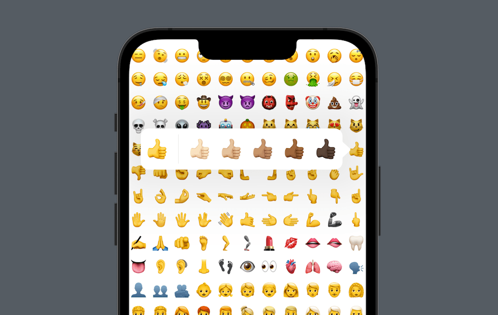
Note that the emoji picker will only add skintones callouts on iOS 16.4, macOS 12 and later versions.
Read More
Emojis
EmojiKit lets you work with emojis in a structured way.
Categories
EmojiKit defines all emoji categories and their emojis.
Localization
EmojiKit supports localization for all emojis and locales.
Skin Tones
EmojiKit provides you with skin tone information for all emojis.
Version Information
EmojiKit defines emoji versions, OS availability and their emojis.
UI Components
EmojiKit provides you with UI components like grids & pickers.
Pricing
The license tiers are aimed at indies and small businesses. Reach out for a custom plan if you’re an enterprise, have $10M+ in annual revenue, or if your product exceeds $1M in annual proceeds.