KeyboardKit - Brand Redesign In Progress
Mar 30, 2026 ·
KeyboardKit is getting a new icon! We’re moving from a glowing keyboard key to an abstract design with two Ks on a gradient background that carries over from the old icon.
The previous design
The previous icon has been with us for a while. Designed by digital artist Matthew Skiles, it added a glass-like, glowing design to the original, plain keyboard key design.
![]()
While we absolutely loved this design, we have struggled with explaining what the A in the old icon stands for. All attempts to tweak it to better communicate KeyboardKit have been unsuccessful.
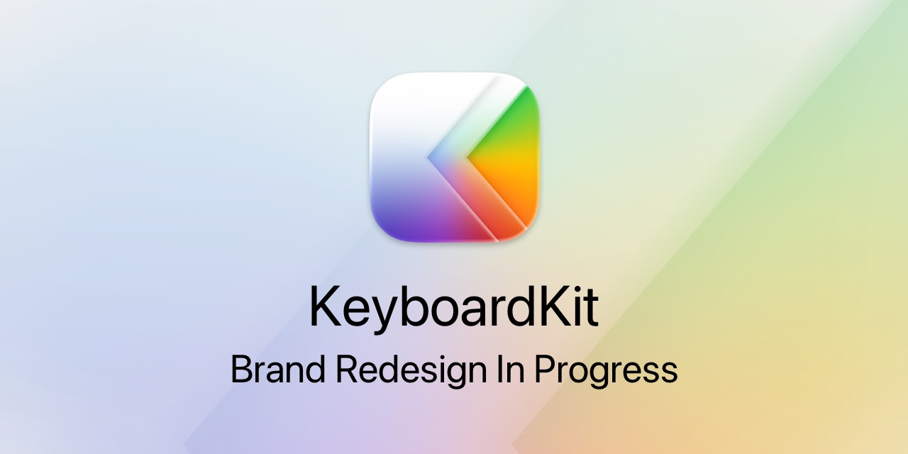
The new design
The new design takes a more abstract approach. Rather than having a literal keyboard key, it has two discrete, K-like glass-shapes set against the gradient background from the previous icon.
![]()
This design lets us carry over the color identity from the original icon and stay true to the brand’s visual roots, while taking the brand in a new, exciting direction.
Implementation
The new icon is a work in progress. We’re trying it out in the open rather than waiting for a perfect result behind closed doors, and we expect to tweak it as we see how it looks in different contexts.
As such, you may find that the previous icon is still being used in some places. We’ll update these as the rollout continues, and would love to hear what you think.
Discussions & More
If you found this interesting, please share your thoughts on Bluesky and Mastodon. Make sure to follow to be notified when new content is published.